The Do’s and Don’ts of Designing Graphics for Trade Show Displays | Vivid Exhibits
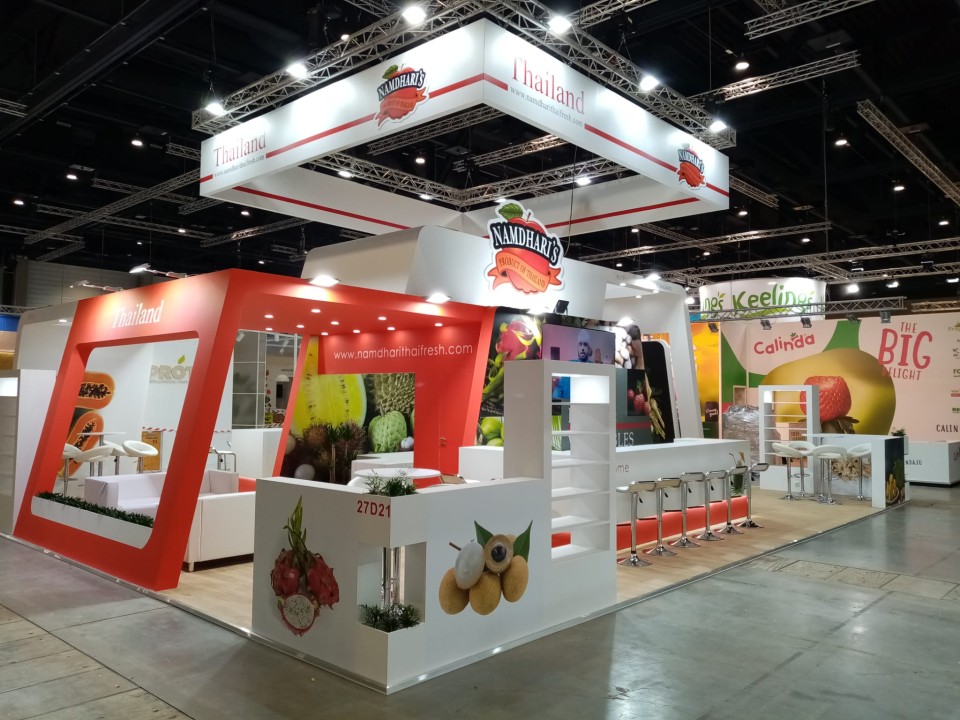
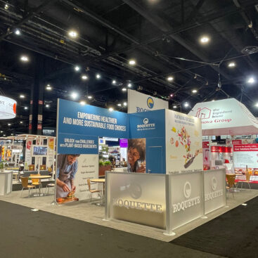
Trade shows are powerful platforms where businesses showcase their products, services, and brand to a targeted audience. One of the most impactful elements of your booth design is the graphics. Graphics are more than visual—it’s how your brand communicates, attracts attention, and leaves a lasting impression.
At Vivid Exhibits, we specialize in creating trade show displays that stand out with professionally designed graphics. Here are key tips on the do’s and don’ts of designing graphics for trade show booths to help you make the most of your exhibition.
Do’s:
- Keep it Simple and Clear: When designing graphics for your trade show booth, less is often more. Avoid clutter and excessive text. Your audience should understand your core message within seconds, so focus on bold visuals and concise copy.
- Tip: Use a large headline or tagline that clearly communicates your main message. It should be readable from a distance.
- Use High-Quality Images: Ensure your images are crisp, clear, and high-resolution. Blurry or pixelated visuals can create a negative impression of your brand.
- Tip: Use professional photography or high-quality stock images that align with your brand’s style.
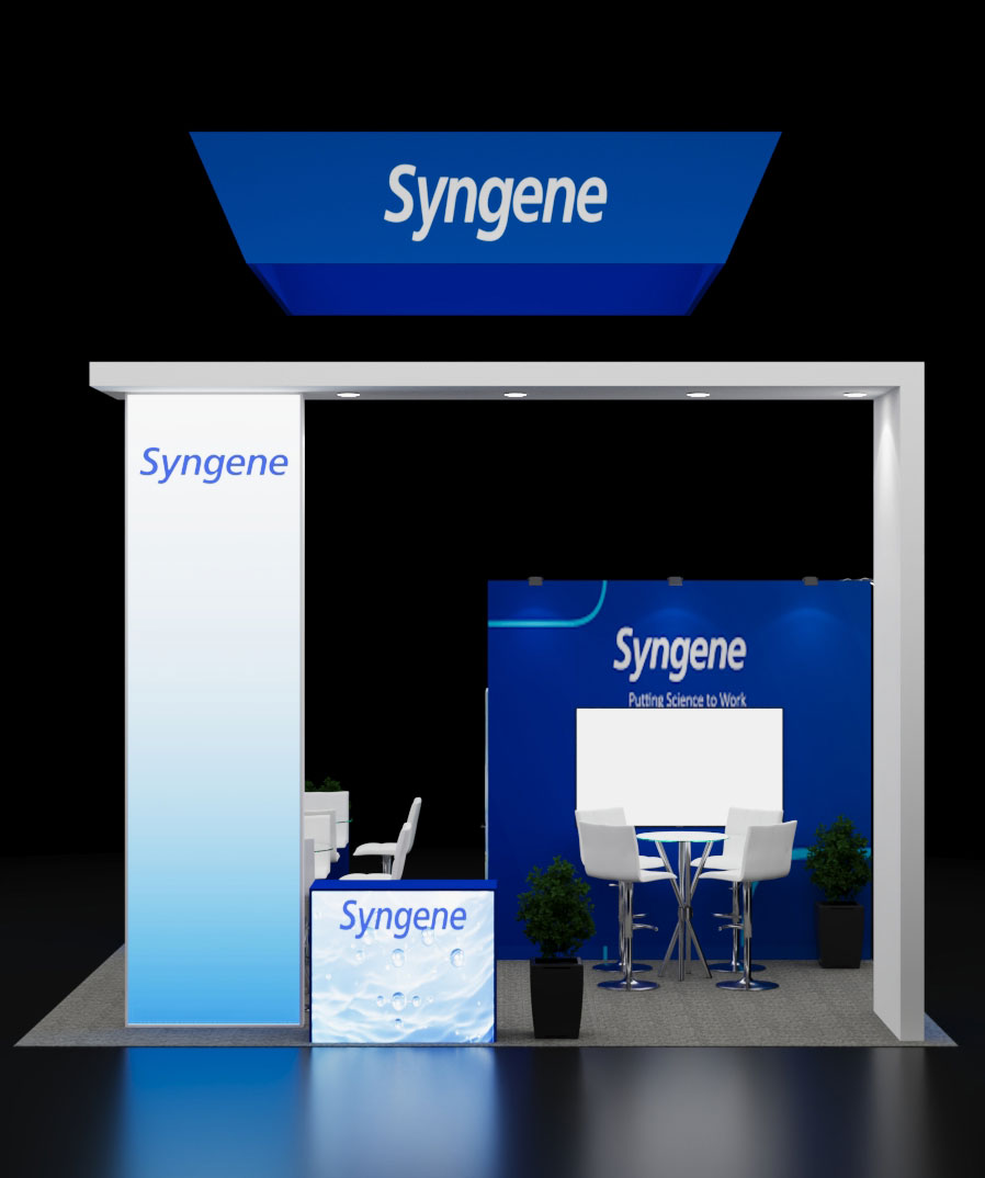
- Maintain Brand Consistency: Your trade show display graphics should reflect your brand identity. Consistency in colors, fonts, logos, and messaging across all marketing materials is crucial.
- Tip: Refer to your brand guidelines for colors, fonts, and logo usage to ensure consistency.
- Focus on Readability: Visitors will only have a few seconds to glance at your booth, so ensure your graphics are easy to read from a distance. Use large fonts with enough contrast to stand out.
- Tip: Use bold fonts for headlines and select high-contrast color combinations for readability.
- Use the Power of Colour: Colors can evoke emotions and influence perception. Use bold, high-contrast colors that align with your brand and message.
- Tip: Stick to 2-3 dominant colors for balance and visual appeal.
- Incorporate Call-to-Action (CTA): A strong CTA encourages visitors to engage with your brand—whether it’s scanning a QR code, visiting your website, or booking a demo.
- Tip: Phrases like “Learn More,” “Get a Free Quote,” or “Book a Demo” are clear and actionable.
- Prioritize Your Unique Selling Proposition (USP): Highlight what sets your product or service apart. Clearly communicate your USP in a few key points.
- Tip: Focus on one or two main messages and avoid overwhelming graphics with too much information.
- Think About the Layout: Ensure your graphics are well-organized and flow in a natural progression. Place important visuals and messages at eye level.
- Tip: Use the “Z-pattern” layout (left to right, top to bottom) for easy readability.
Don’ts:
- Don’t Overload with Text: Avoid long paragraphs or excessive details. Too much text can overwhelm and deter visitors from engaging with your booth.
- Avoid: Blocks of dense text that will not be read at trade shows.
- Don’t Use Too Many Fonts: Using too many fonts can create visual chaos. Stick to one or two complementary fonts for a clean, professional look.
- Avoid: Mixing more than three fonts, which can create inconsistency.
- Don’t Forget About Graphics Size: Ensure your graphics are appropriately scaled to your display size. Small fonts or images will be difficult to see from a distance.
- Avoid: Graphics that are too small or hard to read from across the booth.
- Don’t Use Low-Quality Visuals: Low-resolution or amateur visuals can harm your brand’s credibility.
- Avoid: Using blurry images or clip art.
- Don’t Overcrowd with Information: Avoid trying to fit too much information in a single display. Focus on core messages rather than overwhelming details.
- Avoid: Including excessive information that detracts from the key message.
- Don’t Use Too Many Colours: While colors are important, overusing too many bright or clashing colors can detract from your brand’s identity.
- Avoid: Using excessive colors that create a chaotic visual experience.
- Don’t Neglect Vertical Space: In trade show booths, vertical space is often underutilized. Utilize this space for impactful visuals.
- Avoid: Placing graphics only at eye level. Utilize height for attention-grabbing visuals.
Conclusion: The design of your trade show graphics plays a pivotal role in how your brand is perceived. By following these do’s and don’ts, you can create a booth that attracts attention, communicates your message effectively, and leaves a lasting impression.
At Vivid Exhibits, we offer professional graphic design services to help you craft visually striking and engaging trade show displays. Whether you are renting or purchasing a booth, we have the expertise and solutions to elevate your brand.
Ready to transform your trade show experience? Contact Vivid Exhibits today and let us help you design graphics that captivate, engage, and convert visitors into loyal customers!